Visual Impact: Enhancing Player Feedback
Author: Daniel Ben Zvi
Date: 02/03/2024 EST
Blog Entry Part 1: The Suggestion
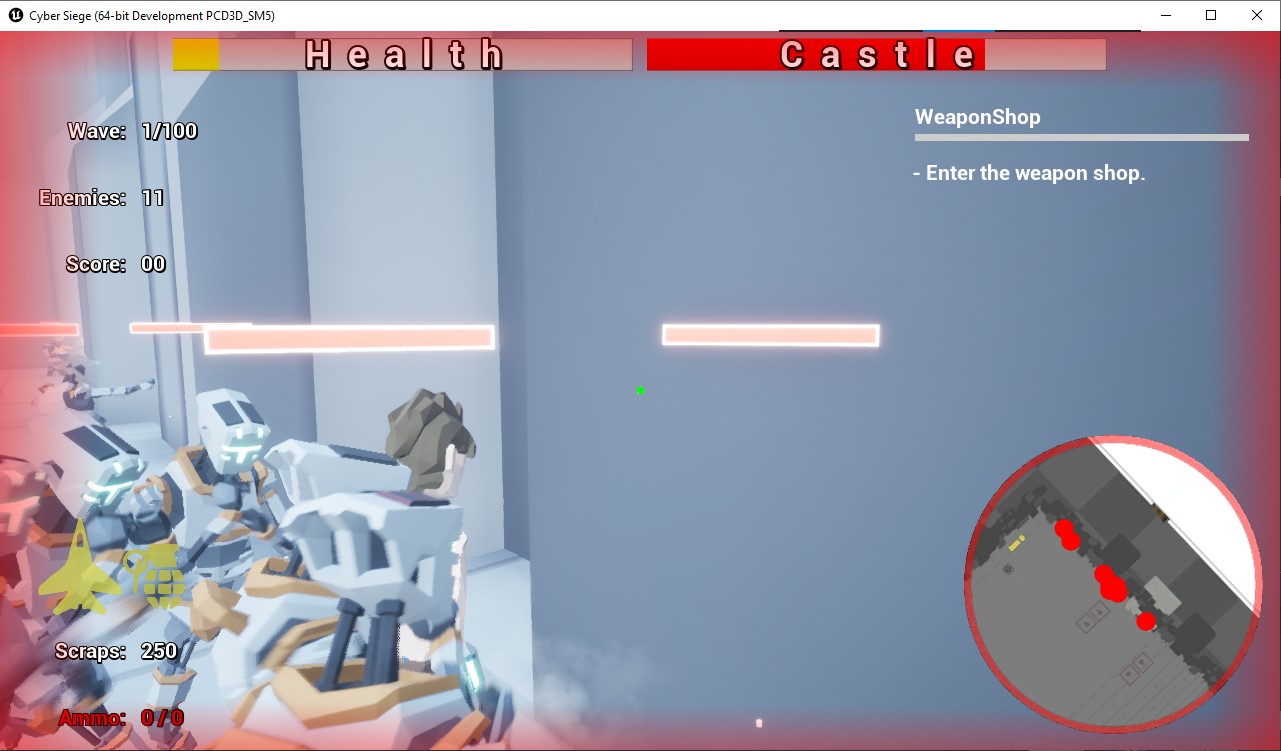
This week's focus was on elevating player experience through enhanced visual cues. Acting on the suggestion from our instructor, I took on the task of implementing a visual indicator for player and castle hits. The initial concept involved flashing the edges of the screen with a gradient red color to signify impacts. Implementing this required a thoughtful approach to prevent overlapping and ensure a smooth transition.

Blog Entry Part 2: Iterative Implementation
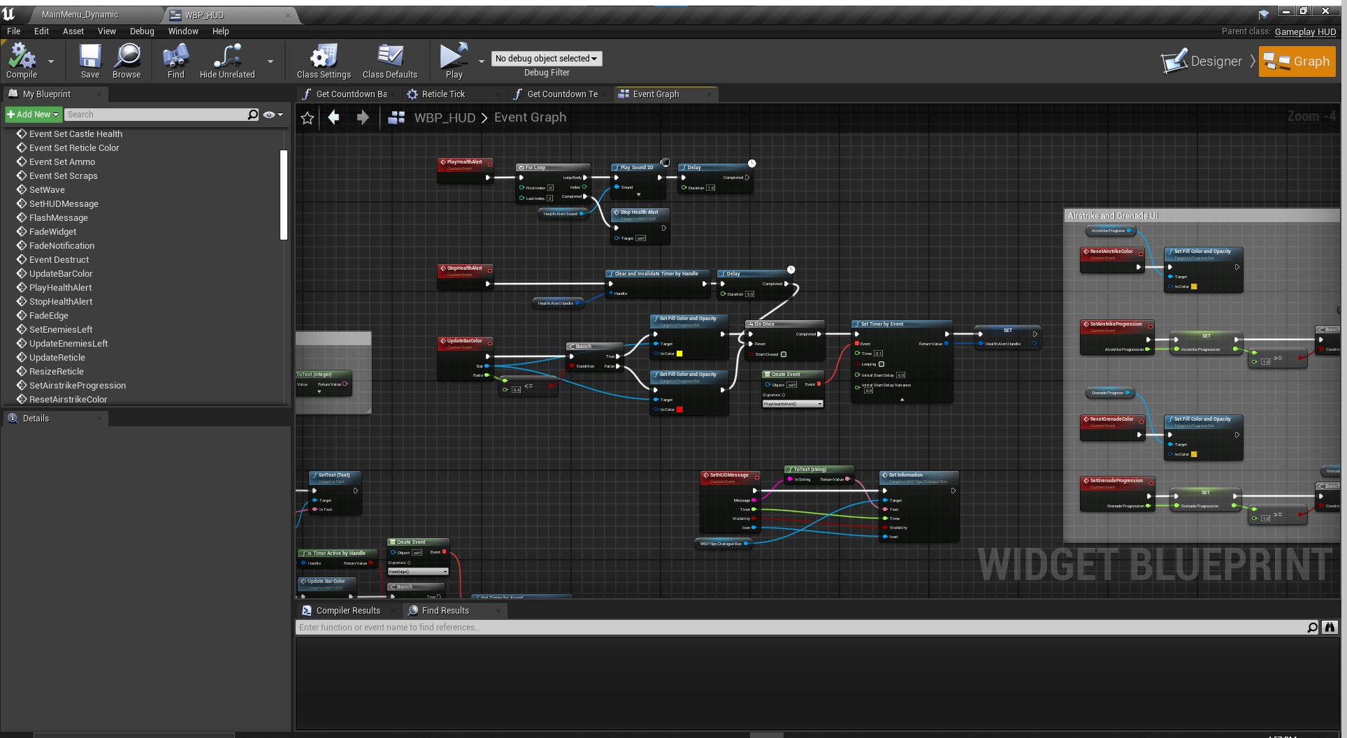
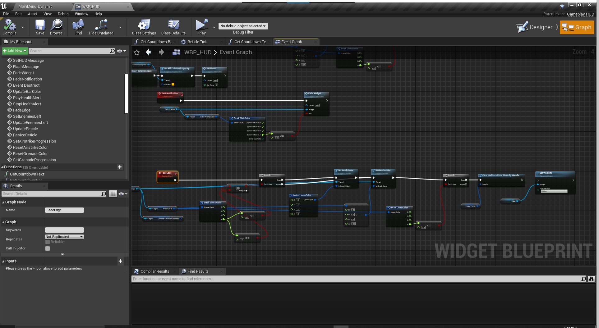
As development progressed, feedback from both the team and external sources suggested improvements. The decision was made to split the effect into two distinct regions: the entire screen edges for player hits and the minimap frame for castle hits. This iteration aimed at providing clearer and more contextual feedback to the player. Ensuring the effectiveness of this visual cue involved refining the timer logic, introducing SFX, and addressing potential disruptions to the gameplay flow.


Blog Entry Part 3: Refinement and Optimization
To enhance the overall experience, additional refinements were made. The flashing effect was carefully adjusted to avoid unnecessary disruptions, and a reset mechanism was implemented to maintain a seamless gameplay flow. The goal was to strike a balance between impactful visual cues and ensuring they complement rather than detract from the gaming experience.
This iterative process of implementing and refining visual cues not only addresses specific feedback but also underscores the importance of continuously seeking ways to improve player engagement and immersion.
Get Cyber Siege
Cyber Siege
Third-to-First person Castle Defense game
| Status | In development |
| Author | TheCodeCollective |
| Tags | 3D, First-Person, Futuristic, Robots, Singleplayer, Third-Person Shooter, Tower Defense, Unreal Engine |
More posts
- Revamping Reticles: Adding Specific DynamicsFeb 02, 2024
- Spider Enemy Dying in the AirFeb 01, 2024
- Small Changes: Beginning vs End of developmentJan 27, 2024
- Airstrike TimerJan 25, 2024
- Overcoming Code Mazes: Transitioning to Radial Progress Bars in Unreal EngineJan 20, 2024
- Airstrike Power-UpJan 18, 2024
- Resuming the Journey: Maintenance & PlanningJan 13, 2024
- Drone Enemy Particle Effect BugJan 11, 2024
Leave a comment
Log in with itch.io to leave a comment.