Optimizing UI Implementation: Merging Menus for Efficiency


Author: Daniel Ben Zvi
Date: 10/27/2023 EST
Part 1: The Problem
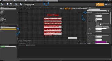
In my game development journey this week, I encountered a significant UI challenge. My UI elements, residing in both the Main Menu and in-game Pause Menu, were initially separated into distinct blueprints. This division made it arduous to maintain consistency, potentially leading to issues for end users.
Part 2: Problem Solution
To tackle this issue, I set out to refine my UI implementation. Initially, I explored the idea of using a base blueprint to handle shared UI elements and derived blueprints for specific implementations. Unfortunately, I faced limitations when trying to modify the base blueprint from derived ones. This limitation made it difficult to implement necessary changes.
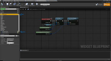
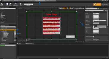
After experimenting with various approaches, I concluded that merging the Main Menu and in-game Pause Menu into a single blueprint was the most efficient solution. This blueprint will include a built-in state-switching mechanism to control widgets and execution logic based on the active menu required for the scene, eliminating redundant UI components. This optimization not only streamlines UI development but also ensures consistent UI behavior, enhancing the overall user experience.
Get Cyber Siege
Cyber Siege
Third-to-First person Castle Defense game
| Status | In development |
| Author | TheCodeCollective |
| Tags | 3D, First-Person, Futuristic, Robots, Singleplayer, Third-Person Shooter, Tower Defense, Unreal Engine |
More posts
- Visual Impact: Enhancing Player FeedbackFeb 03, 2024
- Revamping Reticles: Adding Specific DynamicsFeb 02, 2024
- Spider Enemy Dying in the AirFeb 01, 2024
- Small Changes: Beginning vs End of developmentJan 27, 2024
- Airstrike TimerJan 25, 2024
- Overcoming Code Mazes: Transitioning to Radial Progress Bars in Unreal EngineJan 20, 2024
- Airstrike Power-UpJan 18, 2024
- Resuming the Journey: Maintenance & PlanningJan 13, 2024
- Drone Enemy Particle Effect BugJan 11, 2024
Leave a comment
Log in with itch.io to leave a comment.