Level Design
Author: Austin Anderson
Date: 11/30/23
Problems:
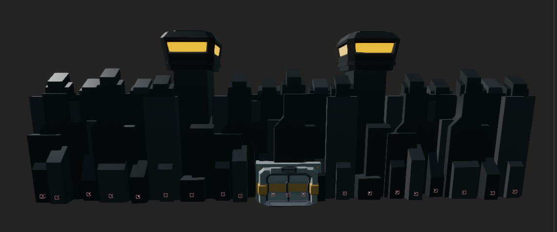
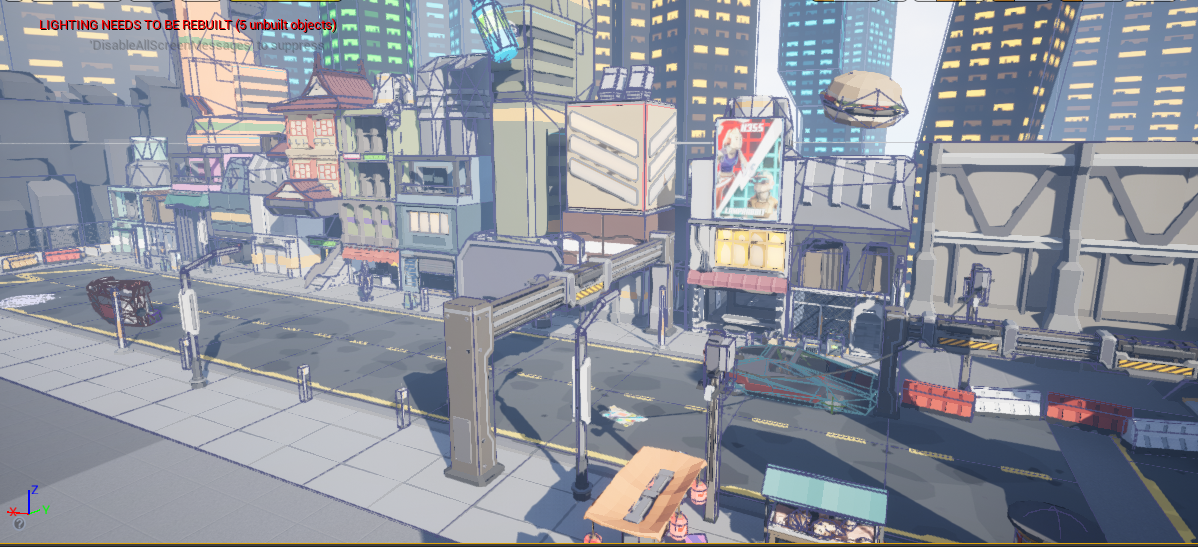
The "problem" this week was level design. More specifically, there were certain things on the level that needed level design attention. The castle, for example, was just a big white cube, so this was one of the first steps in the level design process. Then the enemies needed a spawn building. After that, came the outside walls behind the enemies, I had to change them from brown rectangular cubes to futuristic city buildings. Last and, to be honest, probably least, was the background buildings. These were by far the easiest.
Solutions:
First thing was first, the castle needed a makeover, I changed it from a bland white cube to a 25-meter tall fortress with watchtowers and a large door so it appears as if you could enter if you wanted (you can't).
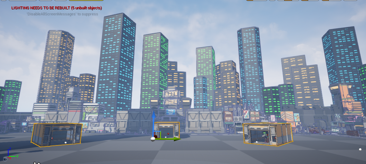
Next up was the enemy spawn buildings. These were fairly simple, I just needed buildings for the enemy to spawn in that were big enough for the mech enemy to get out of. I placed 5 of these buildings at the 5 spawn areas with the spawn area positioned towards the back of the building.
Now that I had placed the enemy spawn buildings, the outside walls needed to get placed. I took out the brown walls and began placing buildings all the way around the back edges.
Lastly, was the background buildings. The were very easy because I could just place them wherever I wanted outside the walls. No precise adjustments were needed like all the other placements of objects and buildings.
Get Cyber Siege
Cyber Siege
Third-to-First person Castle Defense game
| Status | In development |
| Author | TheCodeCollective |
| Tags | 3D, First-Person, Futuristic, Robots, Singleplayer, Third-Person Shooter, Tower Defense, Unreal Engine |
More posts
- Visual Impact: Enhancing Player FeedbackFeb 03, 2024
- Revamping Reticles: Adding Specific DynamicsFeb 02, 2024
- Spider Enemy Dying in the AirFeb 01, 2024
- Small Changes: Beginning vs End of developmentJan 27, 2024
- Airstrike TimerJan 25, 2024
- Overcoming Code Mazes: Transitioning to Radial Progress Bars in Unreal EngineJan 20, 2024
- Airstrike Power-UpJan 18, 2024
- Resuming the Journey: Maintenance & PlanningJan 13, 2024
- Drone Enemy Particle Effect BugJan 11, 2024
Leave a comment
Log in with itch.io to leave a comment.