Level Design
Author: Austin Anderson
Date: 12/7/23
Problems:
There wasn't much of a problem this week, just that the level design needed some more work. I had the outline of the level created, I just needed to start filling in the empty space. The theme is a futuristic, trashy, cyber-punk-like city.
Solutions:
I started big, taking up as much room as possible with large buildings. This would make it easier to fill in space in the end. I tried to use a few of the same buildings as possible, making it look like a unique city, rather than the same few buildings just reused over and over. 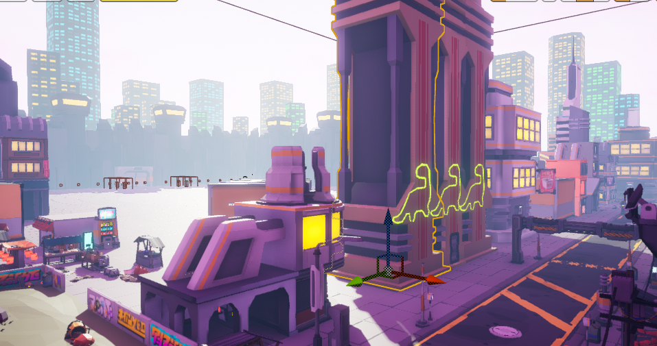
Once the large areas were mostly filled out, I started on the smaller areas, filling them with things like little shop areas and deliberately making the city trashy to fit the theme. Inside the shops are random trinkets, upgrades, robot parts, medical stations, and even alien food.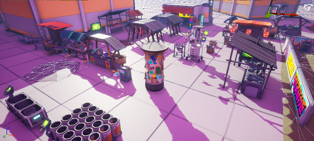
Now that the shops had filled out most of the areas that were left, I could start on the road system. The road was super basic and probably would not make sense in a real-world scenario but I did not see the point in taking the time to make an intricate road system that will not ever be used.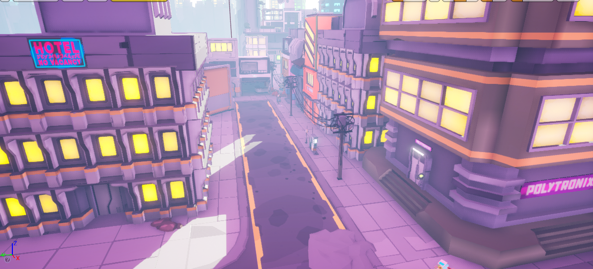
With the roads added, I thought I should block them off to make it seem as if some of the roads were not completed yet. Maybe the basic road system would make more sense if people thought that it was not completed yet.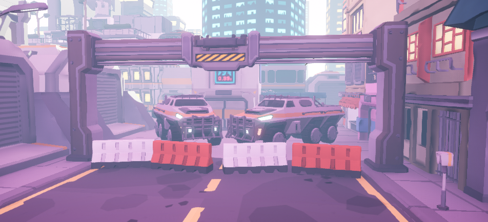
Since there is a road system and road vehicles, it would make sense to add a few vehicles to the level. Here are just a few that were added to the level design. 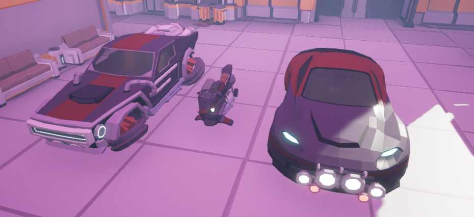
I then realized that I have grass in our asset pack. "How could I add grass into a futuristic city?" I thought. Then I had the great idea to make a depressing, dead city park that was trashed beyond all recognition. 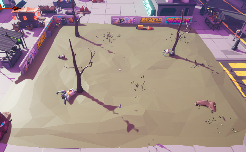
And what depressing city park would be complete without a zub passed out drunk in the corner?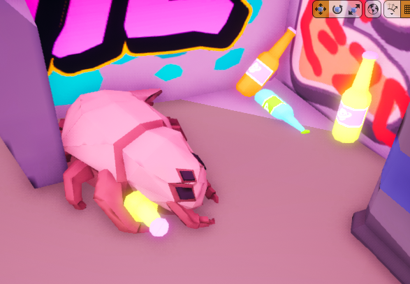
Get Cyber Siege
Cyber Siege
Third-to-First person Castle Defense game
| Status | In development |
| Author | TheCodeCollective |
| Tags | 3D, First-Person, Futuristic, Robots, Singleplayer, Third-Person Shooter, Tower Defense, Unreal Engine |
More posts
- Visual Impact: Enhancing Player FeedbackFeb 03, 2024
- Revamping Reticles: Adding Specific DynamicsFeb 02, 2024
- Spider Enemy Dying in the AirFeb 01, 2024
- Small Changes: Beginning vs End of developmentJan 27, 2024
- Airstrike TimerJan 25, 2024
- Overcoming Code Mazes: Transitioning to Radial Progress Bars in Unreal EngineJan 20, 2024
- Airstrike Power-UpJan 18, 2024
- Resuming the Journey: Maintenance & PlanningJan 13, 2024
- Drone Enemy Particle Effect BugJan 11, 2024
Leave a comment
Log in with itch.io to leave a comment.